
Shopgate Solutions
Shopgate provides omnichannel technology solutions for retailers.
Shoppers today are agnostic to devices and channels. They expect seamless interactions with their favorite brands on any device, at any location. Unfortunately many retailers today are not equipped to keep up with the changes in the market. Shopgate’s goal is to empower retailers and deliver a connected online and in-store experience through their proprietary omnichannel fulfillment and clienteling apps.
Role & Contributions
I worked with the VP of Product, Product Owners & Managers, our UX designer and developers in bringing these solutions to life. I functioned as the UI lead and product designer, exploring concepts and executions, keeping a consistent design system intact and creating full-fidelity design comps and prototypes.
Overview & Approach
Shopgate produced and distributed a survey to our target market (mid-market retailers) with the goal of better understanding their particular needs and challenges with omnichannel retail. The survey results validated our suspicions — that connecting online and in-store retail is a doozy of achallenge for most of them: it’s laborious, time consuming, expensive and technically cumbersome. Additionally, those that are providing some form of omnichannel retail rely heavily on phone calls and manual inventory searches.
We addressed their particular challenges by providing two interconnected tablet apps, Relate (clienteling) and Deliver (omnichannel fulfillment). These solutions provide:
easy access to product catalogs
visibility into store level inventory
a fulfillment order management system
access to registered customer data
store operational analytics
Relate & Deliver are marketed and sold as two solutions; however, they function as one, with different feature sets accessible in different areas of the app. I worked on all areas of the product, but my focus was primarily on the fulfillment order management system.
Process
We identified and mapped out user flows in the fulfillment journey, outlining the interaction points for the customer and store associates. Through this we were able to identify the most common and expected fulfillment scenarios, as well as, a variety of edge cases that, while important, didn’t fit within the scope of the initial release.
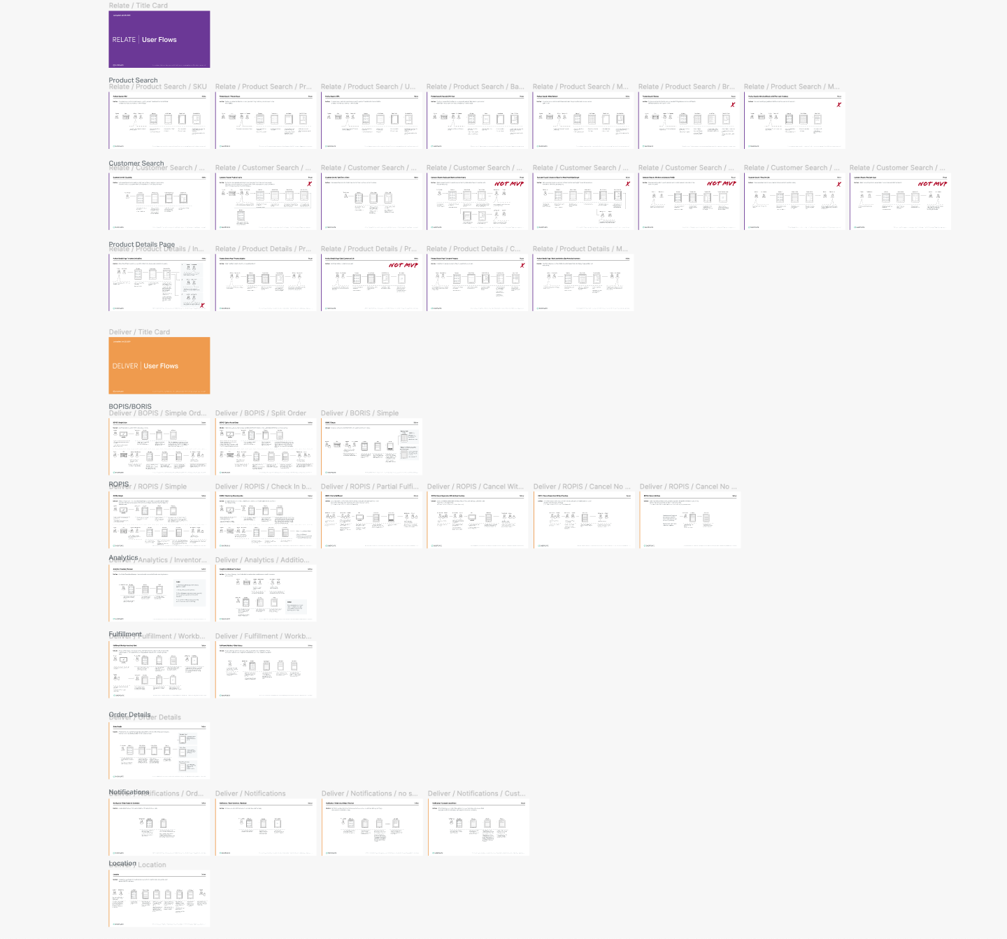
The flow diagrams above have been scaled down intentionally to protect confidentiality.
The “happy path” fulfillment process (shown above) is pretty straightforward, but things can get complicated quickly with different fulfillment methods, product swapping, adding or removing items, etc.

Fulfillment Workbox: Each major step in the process displayed in 3 columns for easy scanning.

Fulfillment order details page. The user must accept and pick the items before moving onto the next step of readying the order.

In edit mode, the nav bar changes colors and obscures some features and functionality, thereby allowing the user to focus solely on editing.

After beta release we had to implement a barrier in the fulfillment flow to ensure accurate reporting. Customers would come in to try on their reserved items and would decide not to purchase. Store associates retrieved the customer’s readied orders, but weren’t completing the fulfillment process of “checking in” customers or completing the order. Without observing the store associates in action we wouldn’t have seen this breakdown until much later.
Additional screen designs
I contributed to the design and UX of other sections of the app including the customer details page, the sales order detail page and the analytics dashboard.
Refinements and modifications
We’ve been refining with each release—improving the user experience, integrating beta client’s feedback and adding in new features from the backlog.
Most recently I’ve been thinking about how to adjust and adapt the fulfillment process, as well as, alter the overall app experience. I’ll be the first to admit that some aspects of the app are clunky. Although it’s not a requirement at the moment, the solutions could better adapt/relate to fit mobile, take advantage of gestures, and have better information organization, spacing and button placement for usability.
Below are a few recent detailed wireframes of the fulfillment listing and details page.